Square
Disputes Recovery Center
Role
Lead Product Designer
Timeline
MVP - 2 months
R2 - 3 months
About
The Disputes Recovery Center transformed a confusing, outdated tool into a seamless and trustworthy solution for sellers reimbursing disputes. By focusing on clarity, flexibility, and automation, we empowered sellers while reducing operational inefficiencies.

Context and problem
The problem
The existing recovery experience was less “streamlined ecosystem” and more “panic-inducing patchwork.” Sellers were confused, agents were overworked, and Square’s recovered funds lagged behind expectations.
The metrics
Our goal was a 2.5% increase in repayment rates, happier sellers, and fewer hours wasted on manual interventions.
Existing solution
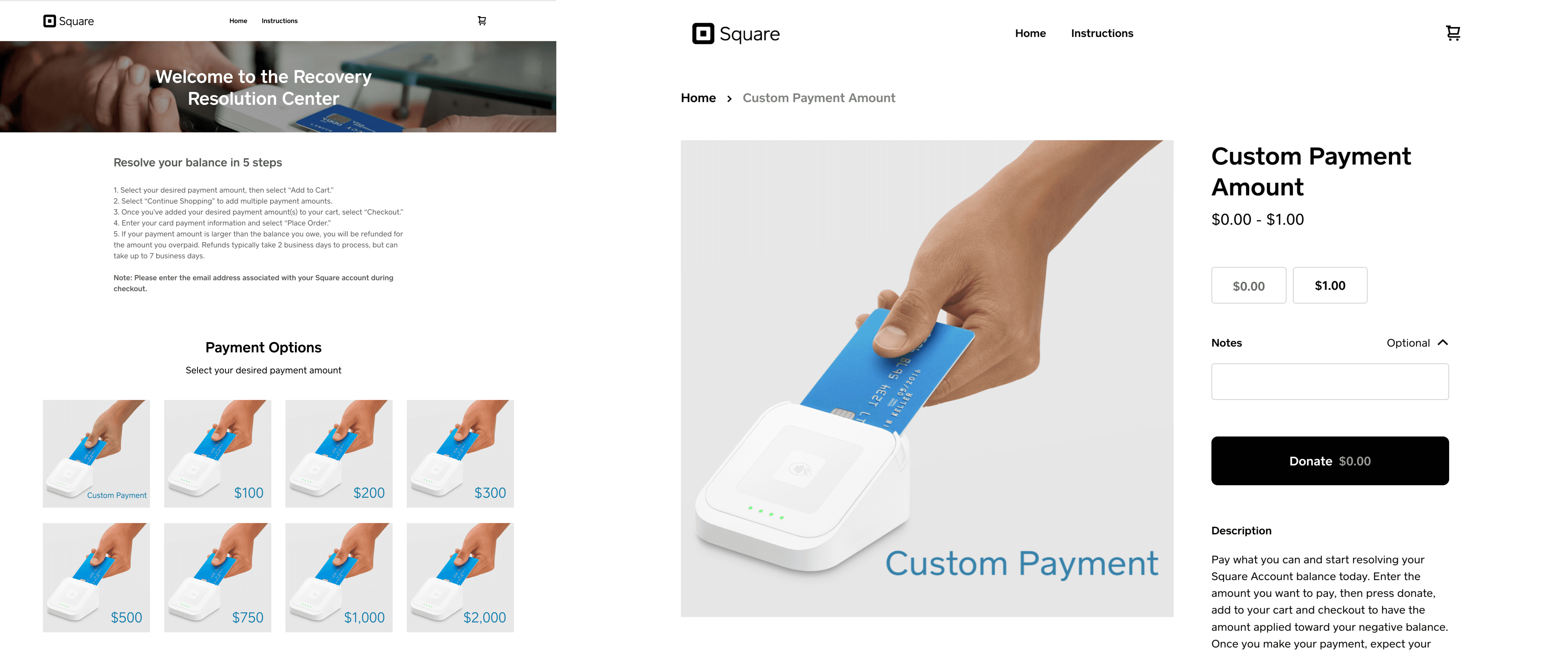
Lack of trust
The design didn’t align with Square’s polished ecosystem, eroding seller confidence.
Cognitive overload
Sellers were required to input exact amounts owed, leading to frantic tab-switching.
Mismatched UI
Buttons like “Donate Now” confused sellers (donate to who?) while irrelevant amounts caused overpayment concerns.
Outcome
The result
By December 2023, we launched an MVP that transformed the Disputes Recovery Center into a seamless, seller-friendly experience.
In 2024, we introduced V2, improving on feedback and scaling the solution to include payment plans. The revamped tool empowered sellers with clarity, control, and confidence while reducing operational inefficiencies.
Post-launch metrics to be collected
2.5% Repayment rate improvement

The outcome
I delivered a scalable ticketing system that simplified life for both clients and agent. The framework utilized and Level 2 (L2) taxonomy to customize journeys and provide clarity on issue resolution, along with a robust ticket tracking and 2-away communication experience.
The Norh Star, this would be our focus of success.
Reduction in AHT

The outcome
I delivered a scalable ticketing system that simplified life for both clients and agent. The framework utilized and Level 2 (L2) taxonomy to customize journeys and provide clarity on issue resolution, along with a robust ticket tracking and 2-away communication experience.
We would monitor the time spent on disputes cases.
Drop-off rates at key steps

The outcome
I delivered a scalable ticketing system that simplified life for both clients and agent. The framework utilized and Level 2 (L2) taxonomy to customize journeys and provide clarity on issue resolution, along with a robust ticket tracking and 2-away communication experience.
Close monitoring of where users drop off before completing their repayment.

Key screens
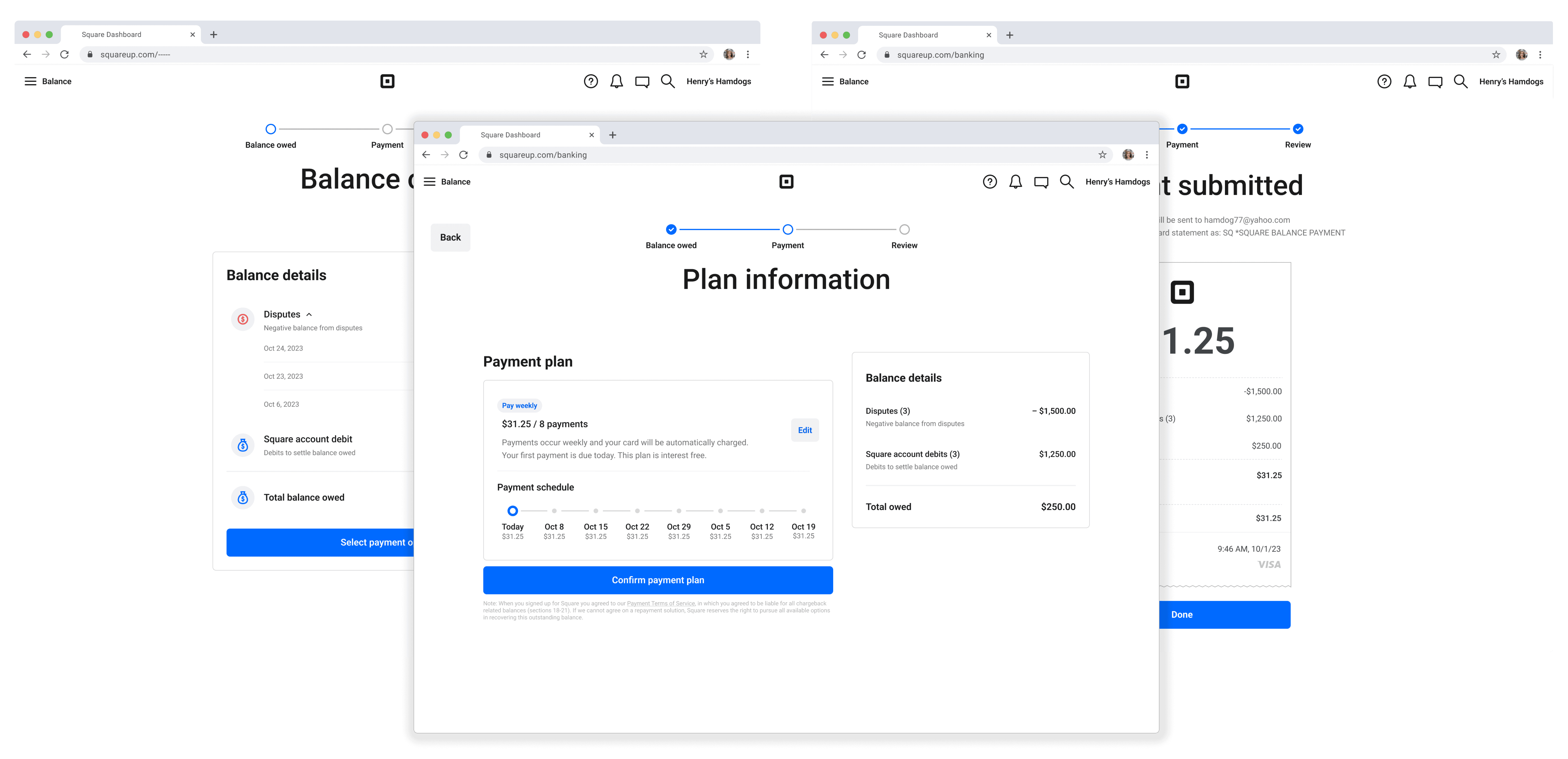
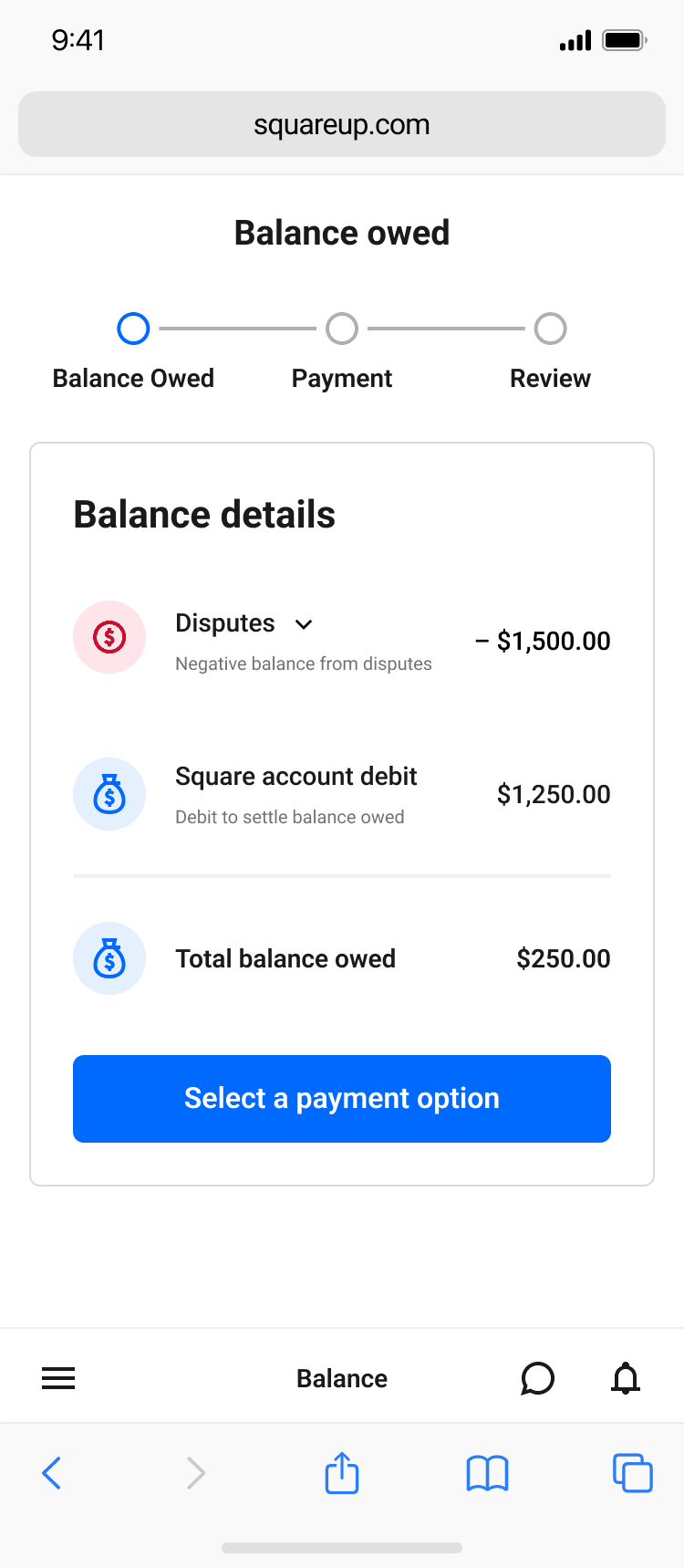
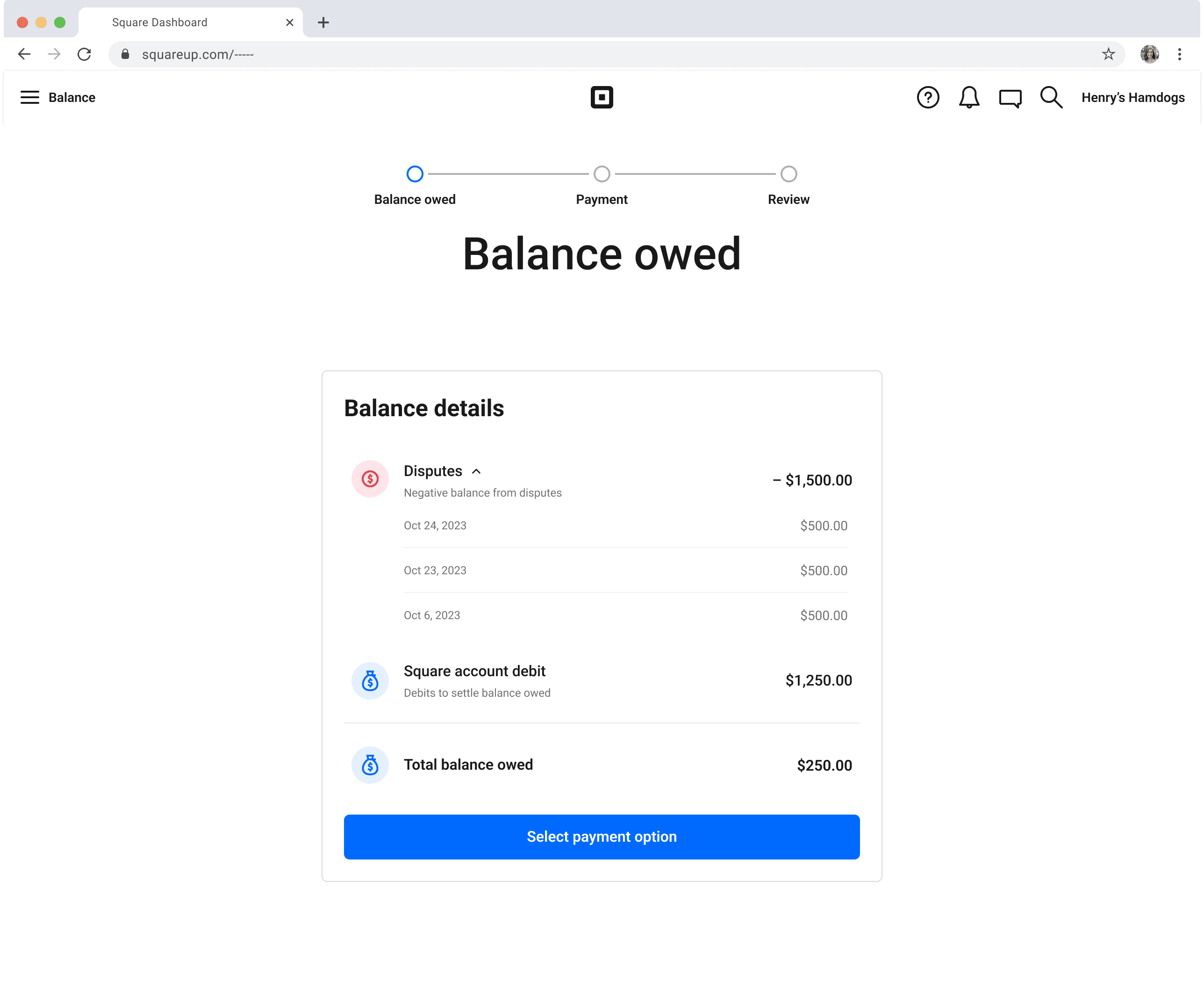
Balance owed
Sellers gain full transparency into the composition of their account balance, with a clear breakdown of disputes, credits, and outstanding balances-empowering them to understand exactly why they owe Square.
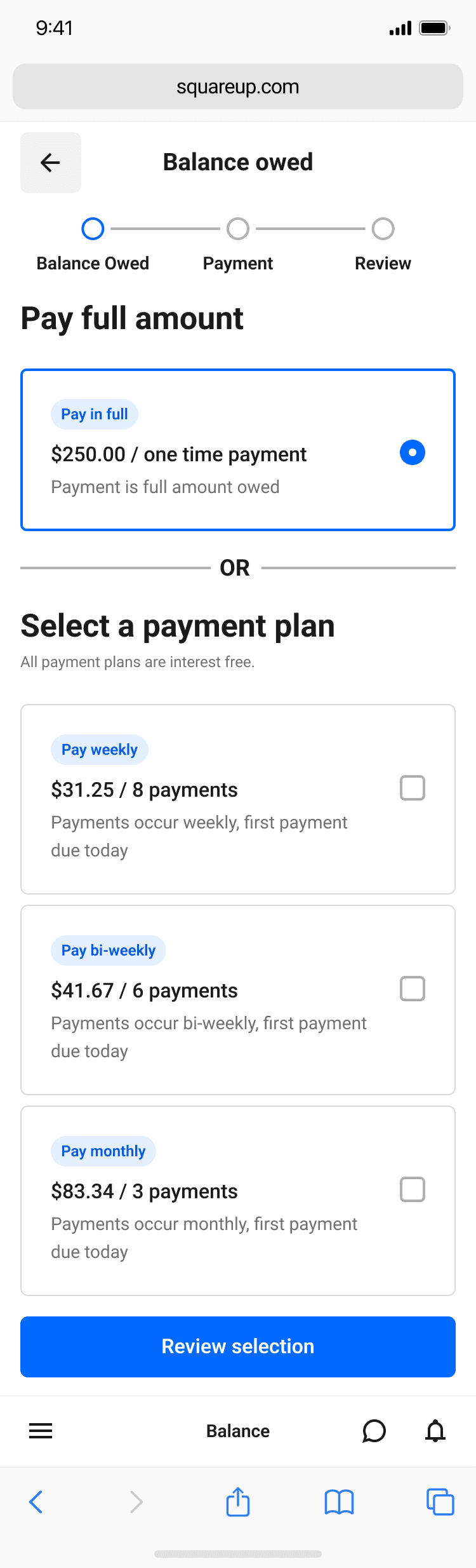
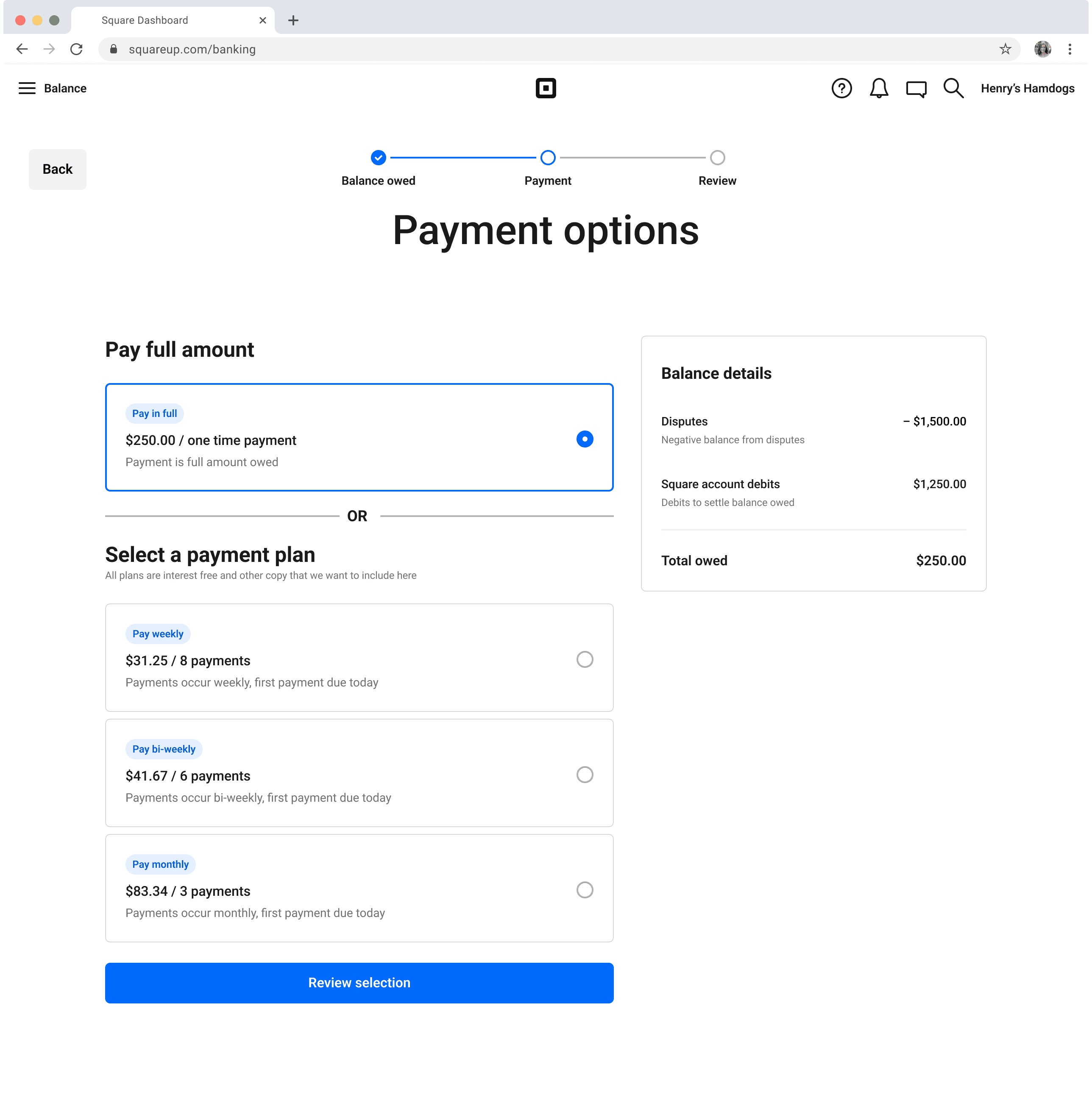
Repayment options
Sellers can choose to repay their balance in full or opt into a structured payment plan, with detailed balance information available throughout the process for reference and transparency.
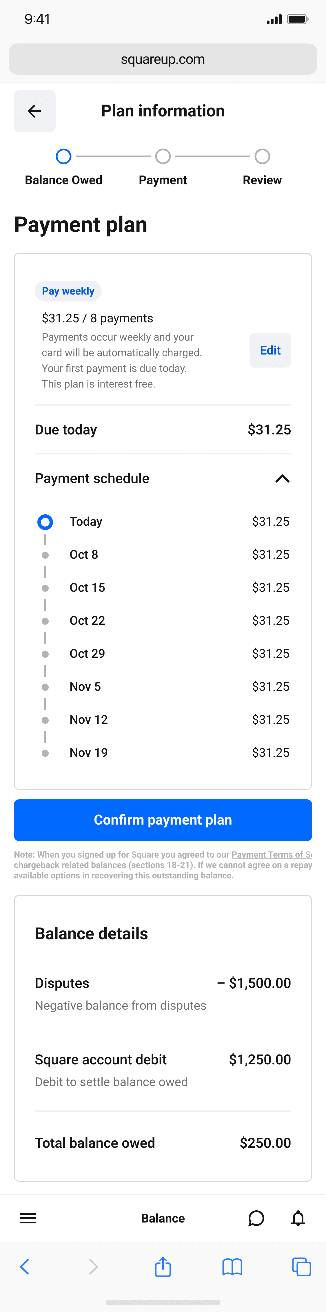
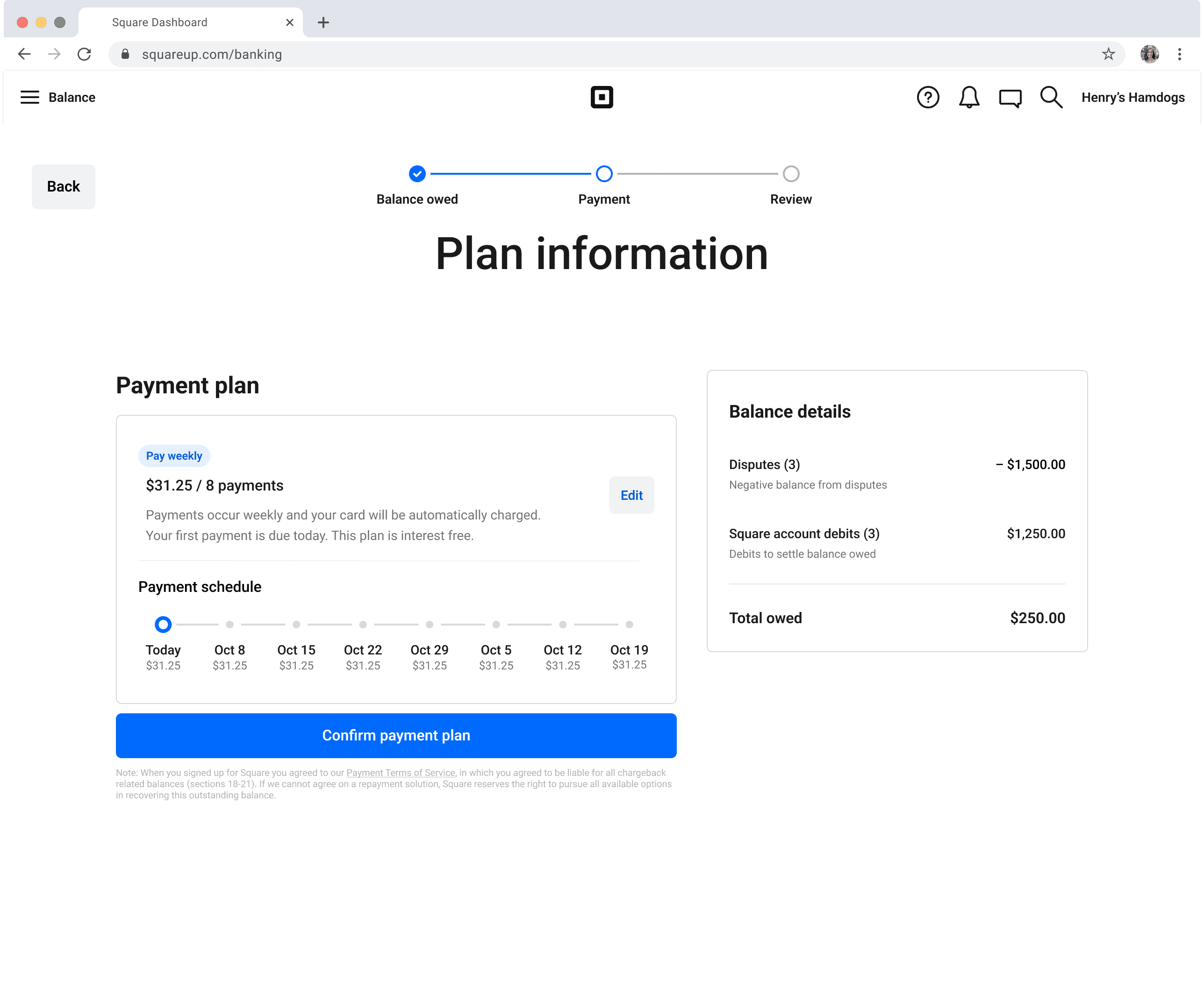
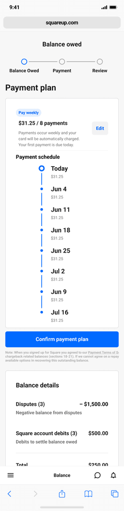
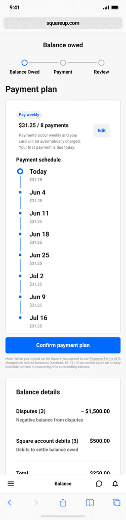
Plan information
Sellers can clearly see the number of remaining payments and their scheduled dates, supported by a visual tracker that helps them easily understand the structure and progress of their repayment plan.
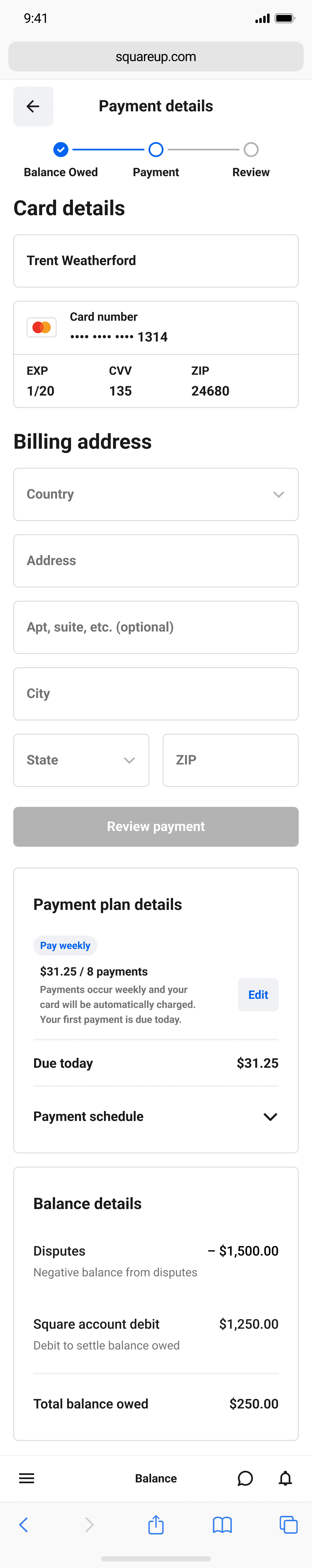
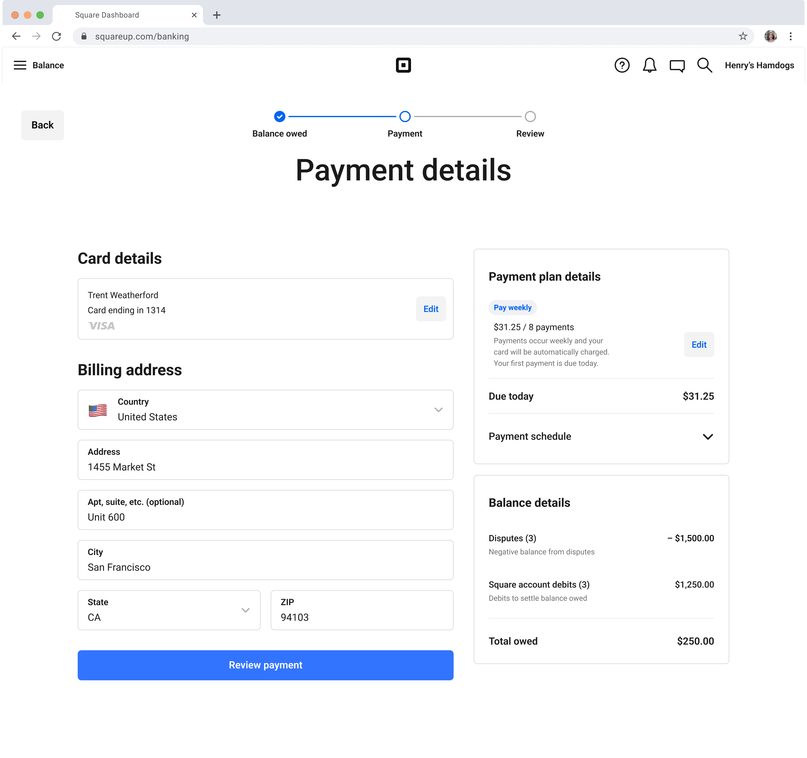
Payment details
Sellers enter their credit card and billing address while viewing their current balance and selected repayment plan to ensuring clarity and confidence before completing.
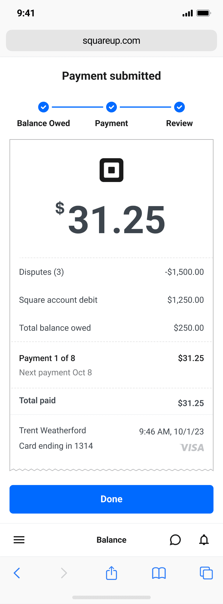
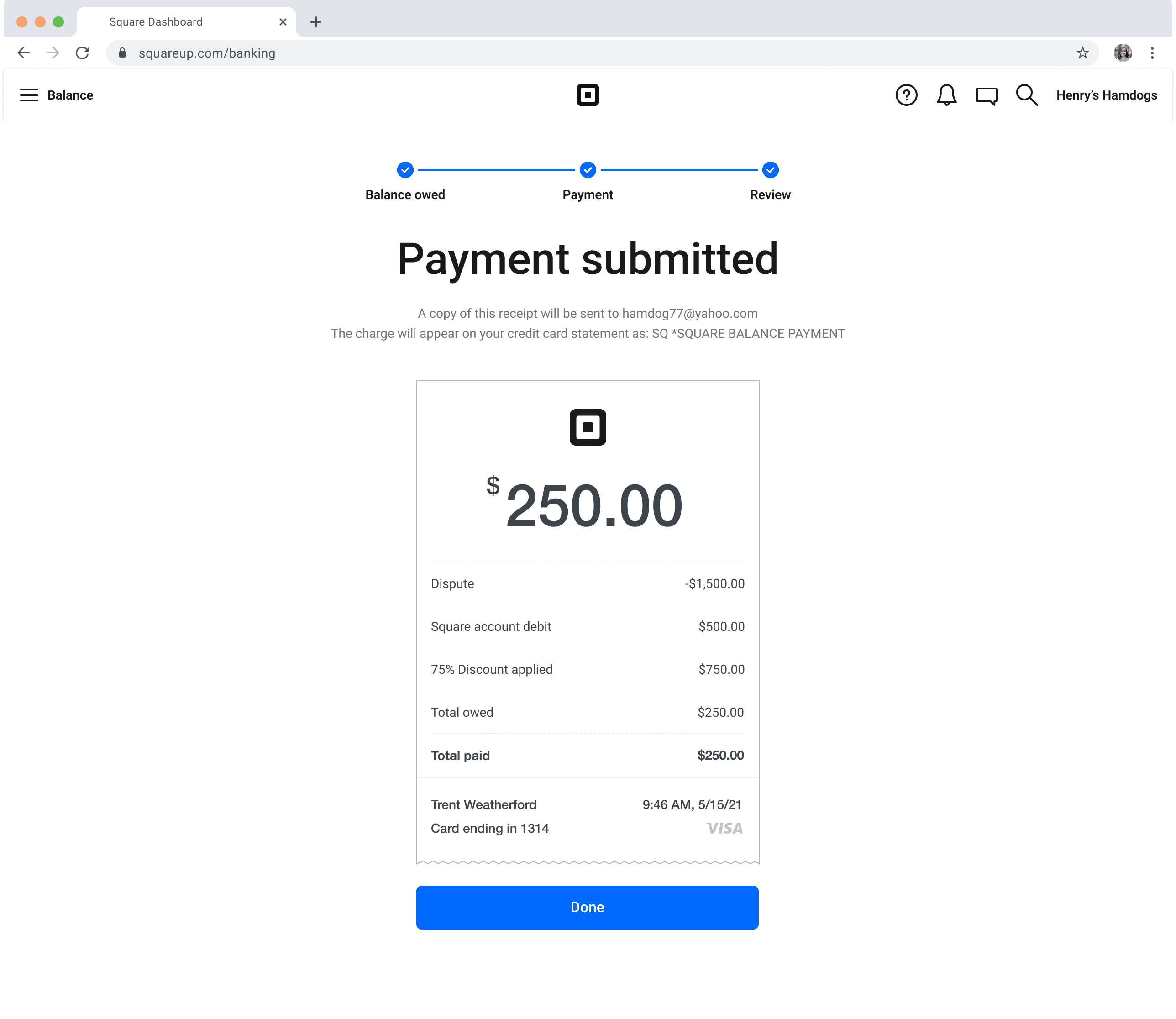
Receipt
Sellers receive a detailed receipt for their first payment, along with a clear breakdown of their repayment plan, formatted similarly to other receipts across the platform for consistency.
Disputes dashboard
After returning to their disputes dashboard, sellers can access the payment blade, where they can view the details of their first payment.
Plan status
If a seller revisits the link, they gain full visibility into the status of their repayment plan, along with options to update their card information or repay the balance in full.

Design journey
Exploration: Understanding the Problem
I collaborated with product, policy, content, and research teams to uncover key pain points:
User interviews highlighted confusion and lack of confidence in the process.
Observing operational workflows revealed agent bottlenecks.
Mapping the current journey against an ideal state exposed glaring gaps and important questions.
Ideation: From Chaos to Clarity
I ideated with design explorations to craft a seamless repayment experience with clear communication, flexibility, and reduced user anxiety.
Key Features:
See Your Balance: Designed a clear, user-friendly display showing what’s owed at a glance.
Select a Plan: Provided flexible repayment options tailored to user needs.
Submit Receipt: Streamlined confirmation flow aligned with Square's existing receipt experience for consistency and ease of use.
Ideation Highlight:
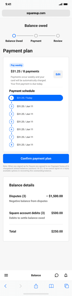
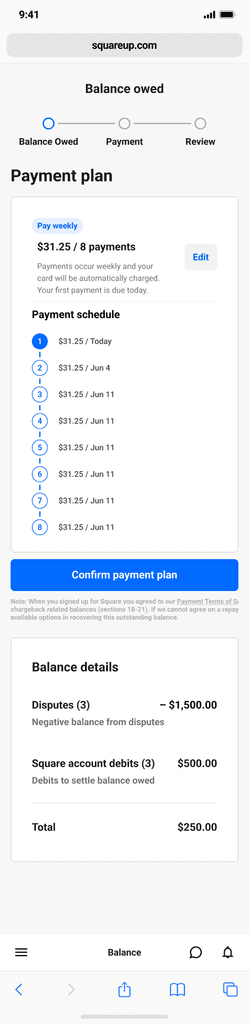
I conceptualized a custom payment tracker to scale seamlessly, reduce user anxiety, and provide clear repayment visibility.
Testing: Reality Check
I facilitated usability testing with five sellers, focusing on comprehension and emotional reactions:
Favorite Finding: Sellers loved the Payment Tracker. One joked, “Finally, a progress bar that makes me feel like I’m winning!”
Eye-Opening Moment: A seller’s reaction to the old website: “Wait, this is Square? It feels like a scam.”
Synthesizing feedback: I simplified flows, clarified interactions, and enhanced accessibility. The dramatic shift found in usability testing turned skeptics into believers.
Delivery: From Figma to Frontend
Every detail was documented: annotated mocks, prototypes, and edge-case visuals. The Figma file became a living record of decisions, ensuring seamless handoff to engineering and a shared understanding across teams.
Impact
Initial feedback has been overwhelmingly positive, with sellers reporting higher satisfaction.
Metrics we plan to track include:
Repayment rates to assess financial impact.
Drop-off points to identify friction.
Operational efficiency gains for agents.

Learnings and Next Steps
Learnings
Collaboration Drives Success: Early involvement of cross-functional partners ensured alignment and feasibility.
Data Is Key: Testing and iteration based on real feedback made the design more impactful.
Empathy Matters: Sellers’ financial stress guided our decisions, ensuring a solution that felt supportive.
Next Steps:
Monitor repayment rates to see if we exceed our 2.5% target.
Analyze drop-off points for further optimization.
Explore automation opportunities to further reduce agent workload.

What started as a patchwork quilt is now a scalable, intuitive solution sellers can trust. The Disputes Recovery Center’s transformation underscores the power of collaboration, data-driven design, and relentless focus on the user experience.
Next case study
Digital Tickets JPMorganChase
View case study
Trent Weatherford 2024
trent.e.weatherford@gmail.com